


Logo
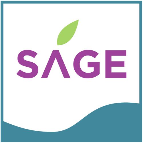
SAGE bonaire
28/01/13 16:34
This was a fun one. A
wonderful client from Bonaire in the Netherland
Antilles contacted me for a logo for her new company.
Taking my inspiration from the island’s habitat as well
as recognizing that this was for a newly-established
financial institution, I designed the below. Muted
colors are out when dealing with Bonaire. Other design
elements included the sage leaf (representing new
beginnings and a bow to the company name) and the water
wave at the bottom. The outside image is in a square
format to represent strength, stability and power. They
loved it.
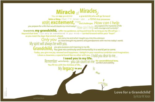
Love for a Grandchild
03/03/12 12:11
Excited to be working with Neal Voron and creating an
image based on an inspiring poem his father, Victor
Voron, wrote entitled “Love for A Grandchild”. For
more information on this beautiful poem or to hear
Victor read it follow the link here...
Neal will be offering prints of the image shortly...stay tuned.
Neal will be offering prints of the image shortly...stay tuned.
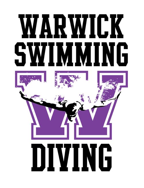
Warwick Swimming
14/12/11 15:46
Busy busy day. Finished
this for the marvelous Warwick Swimming Team, working
on a graphic for a beautiful young girl, our latest app
has been uploaded and we're waiting for final oks, etc,
etc... :)
Hopin' third times the charm!
28/10/10 02:19

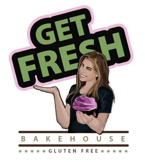
3rd go at this logo. Changing of concepts as far as the meaning of "fresh" in Get Fresh. At first the concept of "fresh" was to be represented by a wink. Hmm, that just didn't work. The second one was just not quite there as the feeling was a bit too "fresh" (as in trouble maker) and wasn't sweet enough. For this third version, we will see if this cute and adorable concept in "Fresh", as in young and fresh, works. (Provided about 6-8 hand drawn rough sketches before that too!) It's all about bringing the right meaning of the store name to a memorable character reference that will please customers.
Some logo concepts go much faster but logo design can be a process until the client hits that eureka moment. Once I spent a week with a corporate client not sure on "just the right shade of brown." That's the job.
Bakehouse Logo
29/09/10 17:32
Working with "Get Fresh"
Bakehouse on a logo. The gorgeous girl in the image was
once one of my bat mitzvah clients! Get Fresh
celebrates enjoying fresh baked goods while staying
within gluten free restrictions. How fabulous!
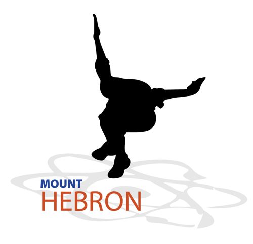
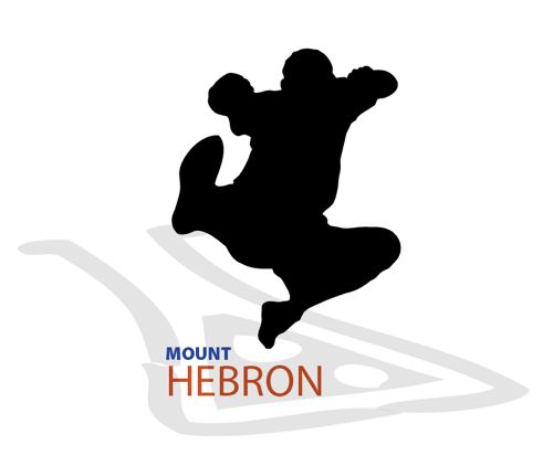
Mt. Hebron School Logo
22/02/10 12:45
Logo concepts for a
science and technology magnet school. The colors of the
school name are meant to vibrant and represent both sky
and red earth in another lean toward the outdoors and
chemicals. They are the only object of color to pull
the eye to the name. The jumping children are showcased
as the main object to best show that this is the main
focus of Mt. Hebron, the children. I would think the
best use of these designs or this design style would be
to use them as a collection and not pick just one. I
made about 6 different versions of the same concept.
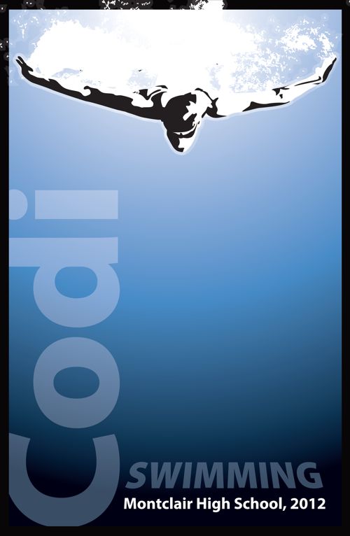
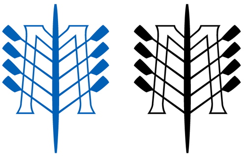
Montclair High School Swim Team
08/03/09 16:33
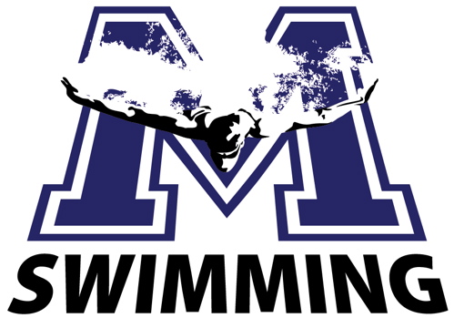
Montclair High School Swim Team logo. I wanted the swimmer graphic to look like it was flying over the M. I was looking for the concept of speed and action. You are supposed to see this and visualize the M on the bottom of the pool.
Crew Dog first try...
13/04/08 11:50
This was tough and still isn't finished. I need a model to base my work on and all the bulldogs I found as samples looked like this...
way too cute!
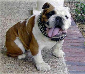
I pulled the sabre tooth fang concept from another dog illustration I found and tried to rework the concept but tried to make it more vicious. I may try to expand the body back to where the text begins. I'll look at it later.
another version of the same:
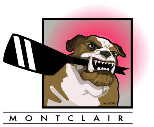
I don't know what I like better here. Now I'm thinking that I like him like this, he looks angrier. Maybe I'll change my mind later. Its always good to walk away from this stuff and revisit it visually fresh the next day.
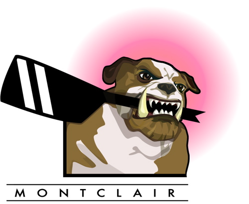
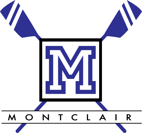
Montclair High School Crew logo
13/04/08 03:29
The Garden Club of Montclair
07/09/07 11:34
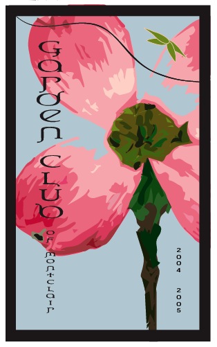
I did lots of work for the Garden Club of Montclair Yearbook when I was focusing on charity organizations.
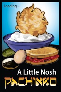
A Yiddisha cup
07/09/07 11:34
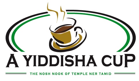
I must credit my friend Julie G. for the title of this logo. Everyone loves this. If you would like this for your own temple please email me at lizol@comcast.net and I will happily put your temple's name in the text for no extra charge and provide you with a store site at my main products site.