


Ad campaigns
Oliner Graphics is on Facebook (finally)
02/03/12 14:17
It's be kind to tall people day. If anyone wants to
take pity on me and "like" my Oliner Graphics fb page, that
would be very kind. I'm trying to remember that
marketing is a good thing to do when one is in
business. Speaking of being kind to tall people.
Am I the only person in the world that actually
grew an inch in her forties? For the past two
years my doctor has informed me that, indeed, I
am now 6'3". Oh my.
FREE! "A Little Nosh" Pachinko Game
17/01/12 18:30
Click the below image to go to our FREE game link!
Whoop! (soooo excited!)

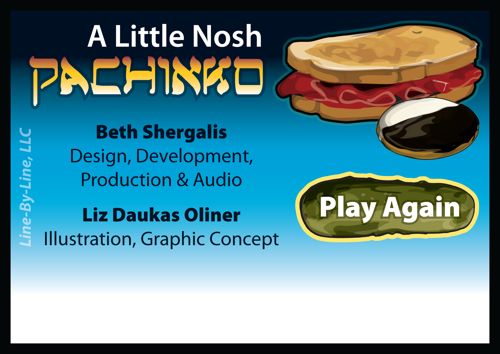
FINALLY! Our latest app is out — and it’s a FREE download!!!
Designed for your iPhone/iTouch/iPad
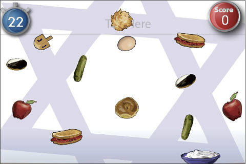
Of course, I’m always thinking in the Jewish/Yiddish style and since I’m also on weight watchers (again), I’m thinking about food ALL THE TIME right now. “A Little Nosh” Pachinko Game is our tribute to the Latkas, corned beefs on ryes, pickels, sour cream and black and white cookies of your past and future.
Have some fun trying to get the latkes to hit the sour cream and rack up points. The high point score in the Oliner home is 23.
FINALLY! Our latest app is out — and it’s a FREE download!!!
Designed for your iPhone/iTouch/iPad
Of course, I’m always thinking in the Jewish/Yiddish style and since I’m also on weight watchers (again), I’m thinking about food ALL THE TIME right now. “A Little Nosh” Pachinko Game is our tribute to the Latkas, corned beefs on ryes, pickels, sour cream and black and white cookies of your past and future.
Have some fun trying to get the latkes to hit the sour cream and rack up points. The high point score in the Oliner home is 23.
Friendly Podcast!
10/08/09 12:01
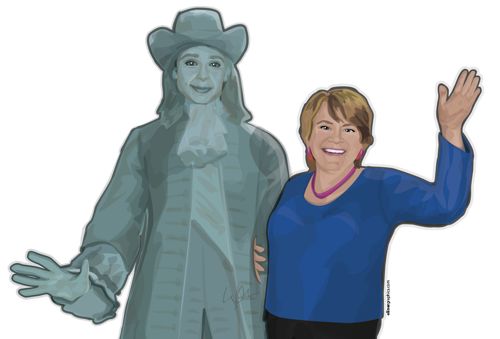
Here's some real fun! This
graphic was created for a series of educational
podcasts for the Friends Council on Education. I
actually created two screens, a sign-on and a sign-off
screen. My client wanted her image only on the exit
image and requested a "bemused" expression on William
Penn. She also wanted to be standing on top of city
hall in Philadelphia with his stature! Wow, I think
we've got it!
Here's what my client had to say: Liz, I just love these images!!! They are fabulous. You got me PERFECT. I can't believe it, actually! BEYOND loved it. ~Ginny
sign-off screen

sign-on screen (no client image)

~enlargement of main image
Here's what my client had to say: Liz, I just love these images!!! They are fabulous. You got me PERFECT. I can't believe it, actually! BEYOND loved it. ~Ginny
sign-off screen
sign-on screen (no client image)
~enlargement of main image


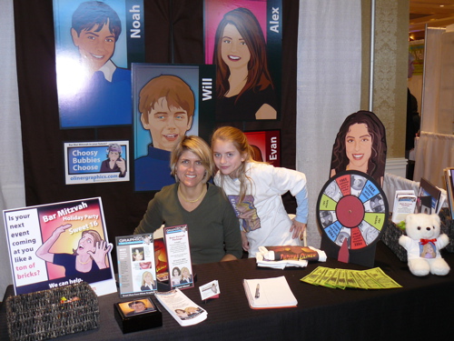
Trade Show
25/01/09 08:22
Another trade show day.
This one's in Teaneck, NJ. I made a bunch of these to
hand out with assorted colors and portraits. I'm also
trying to showcase some "theme illustration" pieces
rather than just the straight portraits.
Can you believe, I put the wrong phone number on this handout?

Can you believe, I put the wrong phone number on this handout?
I've been in this meeting.
23/01/09 09:15
People wonder why I wanted to stop working for
agencies in the city and go on my own. This should be
shown as a warning video to graphic
design/illustration undergrads.
Note: I noticed this you tube video didn't pull up on my husband's PC due to lack of a plug in. So my apologies if this post didn't show properly.
Note: I noticed this you tube video didn't pull up on my husband's PC due to lack of a plug in. So my apologies if this post didn't show properly.
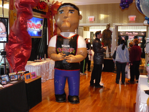
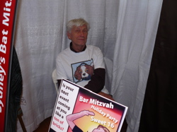
1st Trade Show
24/11/08 09:11
Oliner Graphics participated in its first trade show yesterday. It was very fulfilling and very exhausting. I was extraordinarily busy and didn't get to sit down for 5 hours. There was a giant inflatable man (see below) across the floor from me which was quite distracting. The whole family came and wore my graphic t-shirts and they functioned as walking billboards which proved to be highly effective. I met other great vendors too that I can highly recommend, balloonartistry.com, Sarah Merian, who owns a photo/video company, and "two really fun jewish girls from Brooklyn" Karen & Sharon (917-359-3377) at partymavens.net.
Groovy trade show spinner.
19/11/08 14:47
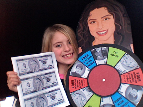
Ok, now we're really having fun. I took a tabletop poster print (11" x 17") mounted it on foam core, cut out the portrait and made a foam core spinner for discounts and prizes. My beautiful assistant is also holding some of the "Oliner Cash Coupons" with her graphic on it that go with it.
Parents! Take a look at that portrait graphic over the spinner. Those tabletop poster prints are fabulous for using in many different ways at your own event. If you request it, I'll be happy to flip the art so that you can place the portrait on both sides of the same piece of foam core and stick it in your centerpiece! There's a great idea!
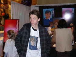
Lauren's World & Trade Show
18/11/08 06:25
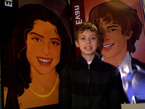
I'm setting up for my first trade show and thought I'd show you how big the portrait posters are and how cool they look next to a standard 12 year old boy. Once again, I took this image with the lowly mac camera (at 6:30 am, very bad light!) on my computer and it needs to be flipped. Why does it do that? With all the programming they have why can't that camera take a right-facing picture that I can use without me having to go into photoshop to horizontal flip???
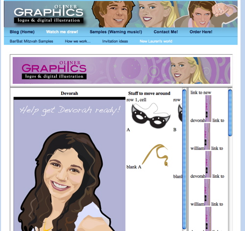
I'm also back to programming again. I love it, I could easily transition to "geek" if I don't watch myself. I'm revisiting a site I made called Lauren's world. Here's the link if you'd like to see it, (click here!) I set this up when I first started programming and my daughter and her friends loved it. Trouble for me was it was too clunky and time consuming to use as an actual product on my site. I'm trying to reprogram the games now using frames (maybe a bit old fashioned, yes) and tables and importing it into my current Rapidweaver page layout program so that its more insync with my site. The goal is to take these pages and make an effortless web page for each of my Bar/Bat Mitzvah kids so that they can have their own Flash RSVP gaming page with their order.
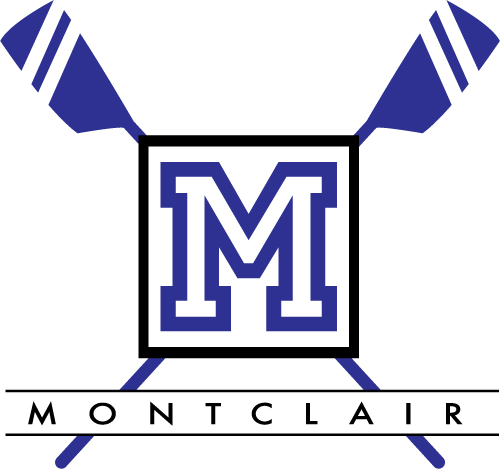
Montclair High School Crew logo
13/04/08 03:29
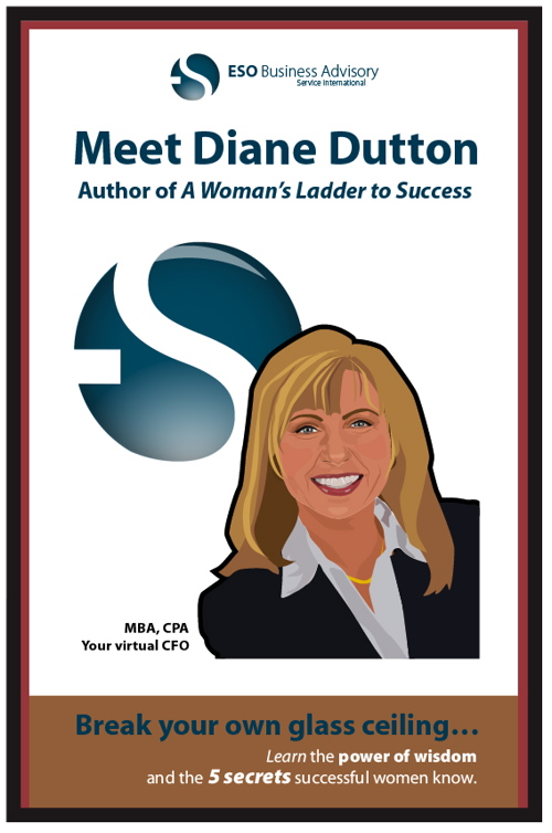
Breaking the Glass Ceiling
23/02/08 19:25

Well, I've been working on that book cover for Diane Dutton. If you've been here before you've read how I did the test image based on myself. Diane has a fabulous website named http://www.businesswomenspeak.com/. She provides straight, clear ideas concerning how to get your voice heard in a male-dominated financial field. This cover is for her book called, "Soar Beyond the Glass Ceiling: Lock in on the secret weapons gauranteed to rocket your career." If you're interested, you can purchase the book with the old cover and title at this address: http://www.businesswomenspeak.com/womenladder.htm
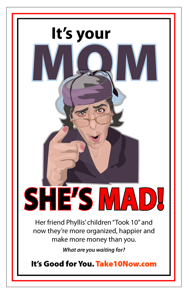
New image for Take 10 Now
04/01/08 09:01

My client has a great sense of humor. Because I'm realizing that people seem to respond more quickly to personal images on the web, I suggested that we pose her (my client) in various guises. Here she is as "Mom". I had her pose and then when drawing the image put the crazy hat, pearls and mom glasses on her. Not to mention I considerable aged her, really she looks about 29. I then went with the idea of the "Uncle Sam wants you" theme and there ya go. My goal with this would be to create a collection of images that her clients could look forward to when they logged in.
The Garden Club of Montclair
07/09/07 11:34
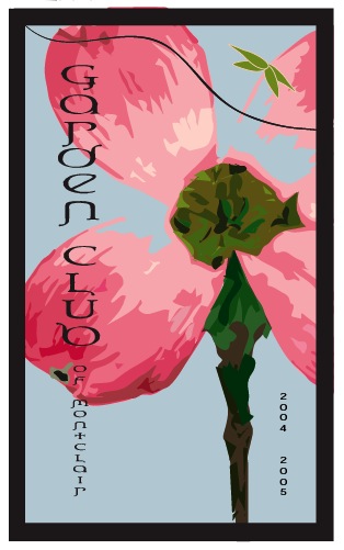
I did lots of work for the Garden Club of Montclair Yearbook when I was focusing on charity organizations.
A Yiddisha cup
07/09/07 11:34

I must credit my friend Julie G. for the title of this logo. Everyone loves this. If you would like this for your own temple please email me at lizol@comcast.net and I will happily put your temple's name in the text for no extra charge and provide you with a store site at my main products site.